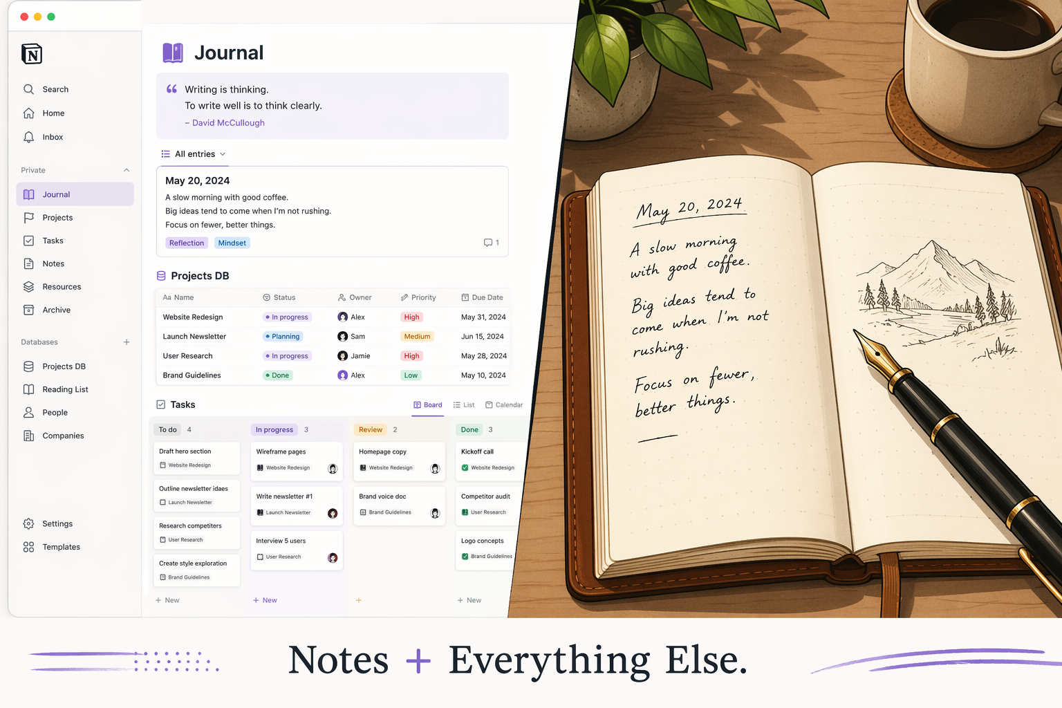
The useful test for iOS 27’s lock screen productivity features is not whether the new lock screen looks calmer in a demo. It is whether you can see a task, remember a sentence, or get interrupted by a calendar alert and do something before the thought starts leaking away.
That small window matters. A student leaving the hallway for class does not need a beautiful widget gallery; they need to catch the assignment before Face ID, app choice, and notification noise turn one sentence into “I’ll deal with it later.” The same thing happens to people with careful Obsidian vaults, tidy Notion dashboards, or well-designed Apple Notes folders. The system usually fails before the note reaches the system.
iOS 27 is interesting because the lock screen appears to move from a display surface toward an intake surface. The strongest gains are not evenly distributed: Apple Notes, Reminders, Calendar, Shortcuts, and Siri get the real advantage first. Obsidian, Notion, and Logseq users may still benefit indirectly, but in the current beta they do not get the same lock-screen surface area.
The compact clock is the boring change that makes the rest possible
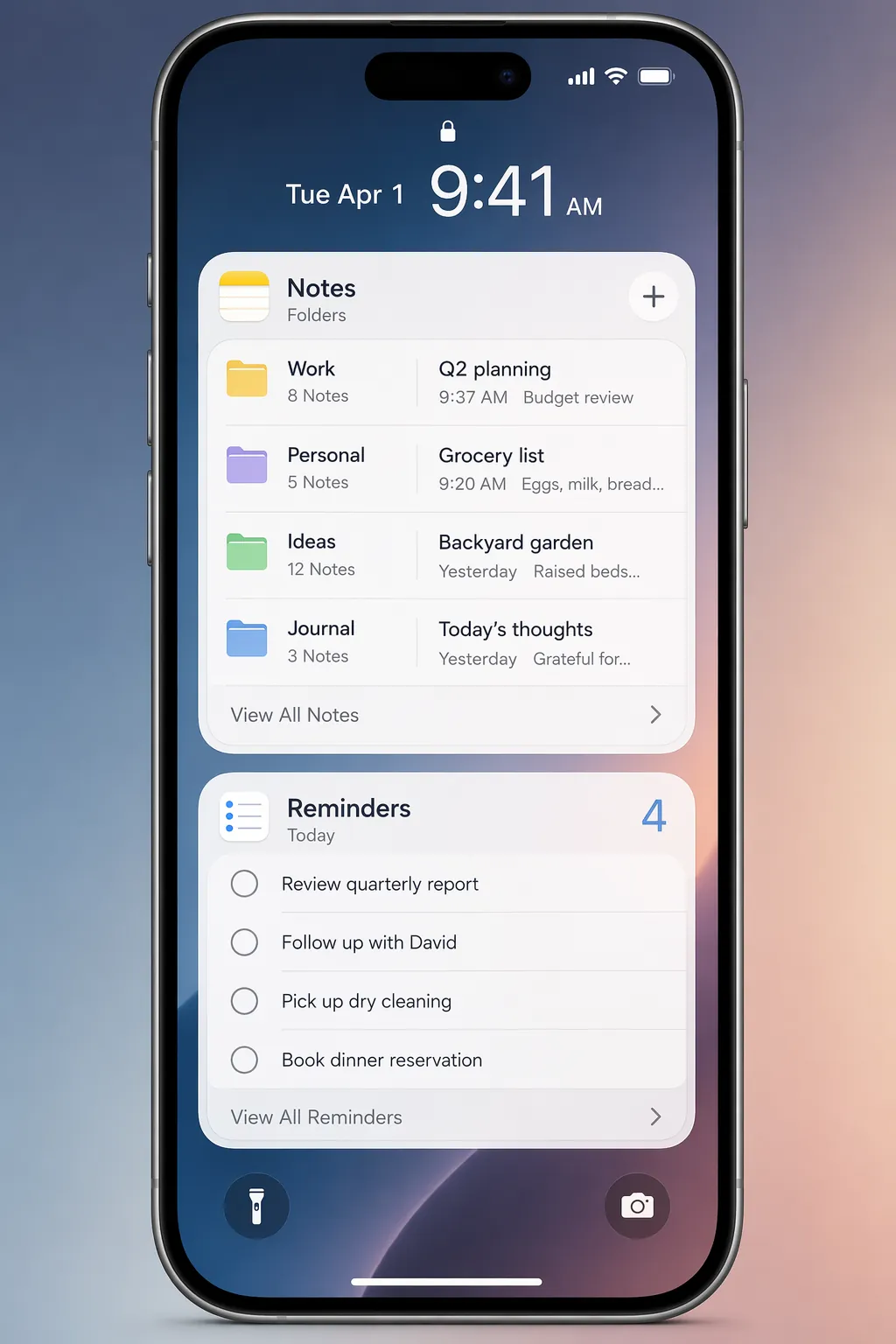
The first meaningful change is spatial. iOS 27 adds an optional compact clock that frees roughly a third of the lock screen compared with iOS 26’s expanded clock, leaving room for two additional small widget slots or one extra-large widget.[1] That is not just a cosmetic trade. On a capture device, vertical space decides whether the lock screen can show a prompt, a list, and enough surrounding context to act without opening an app.
The old small-widget model was useful for status: one note, one reminder count, one calendar glance. The new layout is more useful for work because it can show a chunk of the inbox itself. If you can see several notes from the right folder or several tasks from today’s list, the lock screen starts to answer a different question: not “which app should I open?” but “is the thing I need already here?”
A practical lock-screen setup for notes and tasks
The most useful iOS 27 setup is not a maximalist wall of widgets. It is a lock screen that separates two jobs: quick review and quick capture. Review needs visible surfaces. Capture needs a route that does not ask you to decide where the thought belongs while you are still standing in the doorway.
| Mode | Best iOS 27 surface | What it reduces | Best fit |
|---|---|---|---|
| Glance and review | Notes Folder, Reminders List, Calendar Up Next extra-large widgets | Opening apps just to check what is next | Apple Notes, Reminders, and Calendar users |
| Capture and routing | Notification-triggered Shortcuts | Starting from the alert, then deciding where to put the item | People who capture from prompts, alerts, and recurring reminders |
| Hands-free entry | Siri AI on supported iPhones | Typing, unlocking, and app switching | iPhone 15 Pro or later users who can dictate reliably |
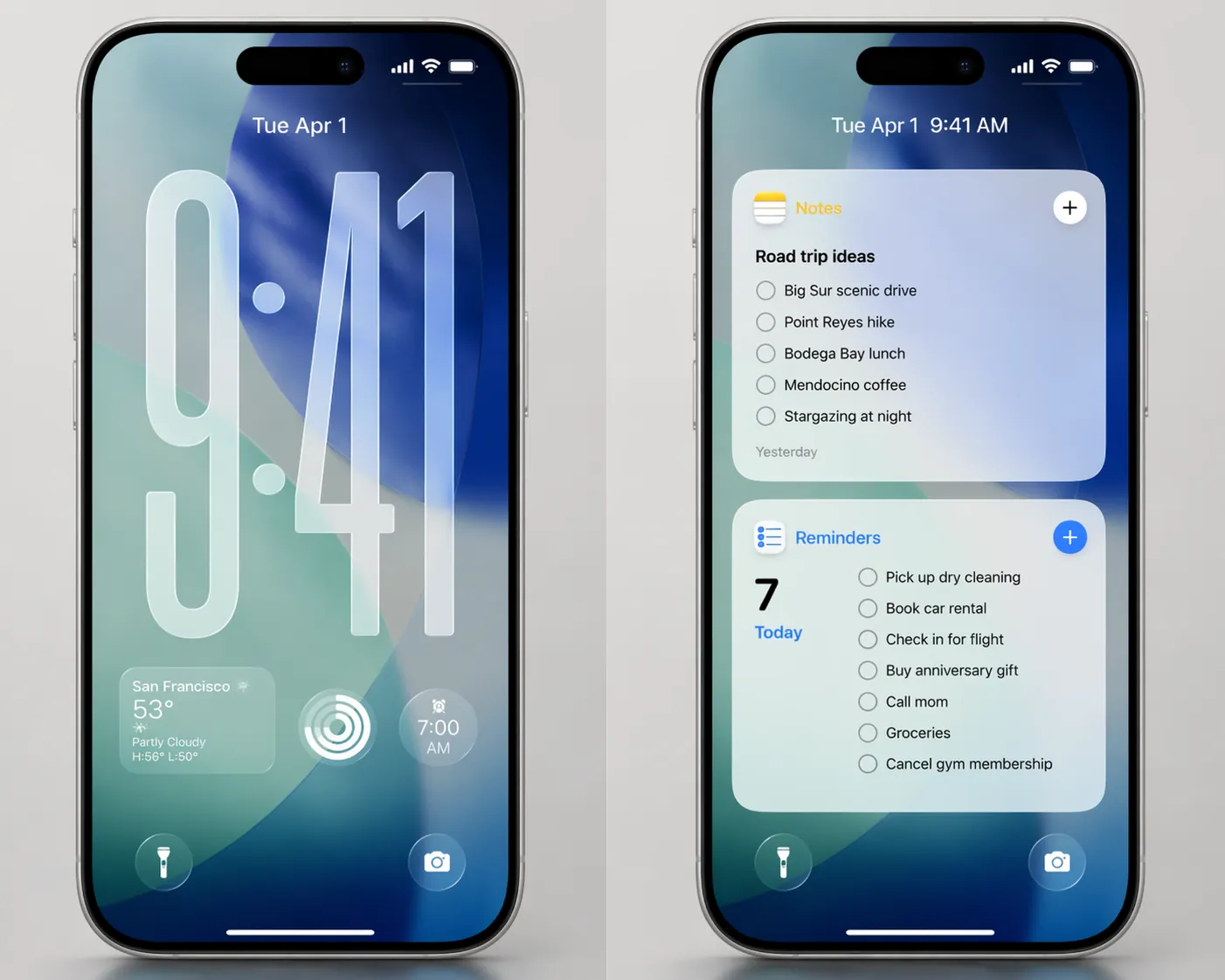
A sensible first layout is simple: put one Notes Folder extra-large widget on a capture-focused lock screen, pair it with a Reminders List extra-large widget on a review-focused lock screen, and let Calendar Up Next occupy space only when schedule context is actually more important than written notes. The lock screen should not become another dashboard to maintain.
Glance and review: where extra-large widgets matter
The Notes Folder extra-large widget is the most important note-taking change in the current iOS 27 beta. It can display multiple notes from a selected folder on the lock screen, a major shift from iOS 26’s smaller single-note widget.[2] That one distinction changes the widget from a shortcut into a working surface.
For Apple Notes users, the obvious folder is not necessarily “All Notes.” It is usually a temporary folder: Inbox, Today, Scratch, Calls, Class, Field Notes, or whatever label collects unfinished material. Showing that folder on the lock screen lets the phone answer a very ordinary question without ceremony: did I already capture this?
That is where the workflow gain lives. A small single-note widget is fine if one note is the whole job, such as a packing list or meeting agenda. A folder widget is better when the job is triage. You see several recent notes, notice the half-finished one, and continue from there instead of making a duplicate note in the wrong app because it was faster.
The Reminders List extra-large widget works the same way for tasks. iOS 27’s larger Reminders widget can show today’s tasks with smart list support directly on the lock screen, and it can be paired with a Calendar Up Next extra-large widget for a broader view of the day.[2][3] For task management, that matters more than another app icon because the lock screen moment is usually a checking moment: what is due before the next meeting, what did I promise, what can be ignored for the next hour?
A knowledge worker between meetings might use the Reminders widget as the default lock-screen anchor during work hours: Today, Flagged, or a smart list filtered to the current context. A student might use it for assignments due today and leave Notes beside it for quick class fragments. The point is not that the widgets magically create discipline. They make the correct list visible at the moment the person is already looking at the phone.
The Apple-native advantage is real
This is where iOS 27 looks strongest. Notes, Reminders, and Calendar are not just apps on the phone; they are first-party surfaces that can be woven into the lock screen, Shortcuts, Siri, and Focus. That gives Apple’s own capture stack an advantage that Obsidian or Notion users cannot fully reproduce from the lock screen yet.
For someone already living in Apple Notes, this is close to the ideal version of low-friction capture: visible folder, visible tasks, visible next event, and native automation nearby. For someone who uses Apple Notes only as a temporary inbox before moving material into Obsidian or Notion, it is still useful, but it creates a second processing obligation. The note may be captured faster, then still need to be moved.
Capture and routing: when the notification becomes the starting point
The lock screen is not only where you check information. It is where information interrupts you. iOS 27’s Shortcuts changes matter because automations can be triggered when a specific notification arrives, making it possible to build flows such as quick capture to Notes from the notification context itself.[4]
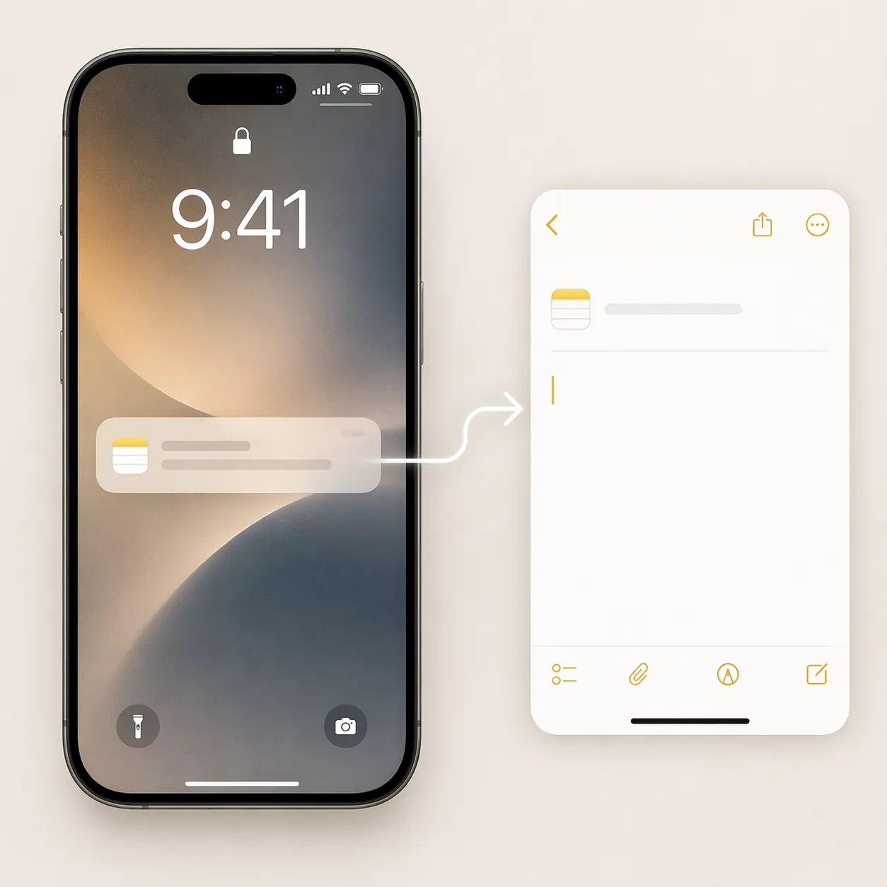
That is a subtle but important change. In many workflows, the notification is the real trigger: a calendar alert before a call, a class reminder, a medication prompt, a recurring review nudge, a message from someone whose requests become tasks. If the automation can begin there, the user does not have to unlock, find Notes, choose a folder, make a new note, then remember why they picked up the phone.
A practical version might look like this: a recurring “end of meeting” notification appears; tapping or responding to the automation opens a capture path that appends text to a meeting log in Notes or creates a reminder with the relevant list already chosen. Another version might route a class-related notification into a school folder. These are workflow designs inferred from the new notification-triggered Shortcuts capability, not measured end-to-end benchmarks.
The new natural-language shortcut builder may make this less intimidating because users can describe the shortcut they want instead of assembling every action manually. MacRumors notes, though, that this shortcut-building feature is still in beta and “not always perfect.”[5] That caveat belongs close to the recommendation: it may help you draft the automation, but anything that captures real tasks should be tested before you trust it during a workday.
What to automate first
- Recurring prompts that already arrive as notifications, such as meeting wrap-ups, class starts, review blocks, or daily planning reminders.
- Capture destinations that can tolerate rough input, such as an Apple Notes inbox or Reminders list.
- Flows with one obvious next action, such as append to note, create reminder, or open a specific capture sheet.
- Automations that fail safely. A missed capture should be annoying, not catastrophic.
The wrong first automation is the one that tries to classify your whole life. The right first automation removes a single repeat annoyance: the same prompt, the same destination, the same small decision, every day.
Hands-free entry: Siri is fastest if your iPhone qualifies
Siri is the fastest capture path when it works because it bypasses the lock-screen layout entirely. In iOS 27, Siri uses the Dynamic Island interface rather than the iOS 26-style full-screen edge glow, so it does not obscure lock-screen content in the same way. It can create Notes and Reminders entries using natural language time, date, and location parsing from the lock screen, but the Siri AI features require an iPhone 15 Pro or later.[6]
That hardware line is not a footnote for productivity workflows. If you have a supported phone, “Remind me when I get to the office to send the receipt” or “Make a note called project questions” can be the lowest-friction path. If you do not, the extra-large widgets and Shortcuts automations matter more because they are the parts of the lock-screen workflow you can actually use.
Voice capture also changes the kind of thought worth capturing. Typing favors short labels. Dictation can hold a messier sentence: the reason behind a task, the phrasing of an idea, the context that will make sense later. That does not mean every dictated note becomes useful. It means the phone can store more of the original thought before you have to translate it into a system.
Focus-linked lock screens are useful if you keep them opinionated
Focus-linked lock screens are the organizing layer rather than the main event. iPhone users can configure different lock-screen widget layouts and connect them to Focus modes that switch by time or location.[7] In iOS 27, that becomes more valuable because each layout can carry larger, more specific widgets.
The useful split is capture versus review. A capture-focused lock screen might show a Notes inbox folder and a single Reminders list. A review-focused work lock screen might show Reminders Today plus Calendar Up Next. A personal evening lock screen might drop the meeting widgets entirely and surface a household list or reading note.
The trap is making six beautiful lock screens that each require maintenance. If the layout does not change what you do in the first few seconds after waking the phone, it is decoration.
Where iOS 27 still does not replace Obsidian or Notion
The current limitation is straightforward: in beta 1, third-party apps such as Obsidian, Notion, and Logseq do not yet support extra-large lock screen widgets.[8] That means the most visible workflow improvements belong to Apple’s native apps first. An Obsidian user can still use Apple Notes as a fast inbox, Reminders as a task front door, or Shortcuts as a bridge, but the vault itself is not getting the same lock-screen treatment yet.
That distinction matters because capture and retrieval are not the same job. Apple Notes can be the fastest place to drop a sentence. Obsidian may still be the better place to connect that sentence to a durable knowledge system. Notion may still be where the project database lives. iOS 27 makes the first step easier for Apple-native workflows; it does not automatically solve the later processing step for portable PKM systems.
There is also a beta-quality boundary around the whole setup. iOS 27 is in beta as of July 2026, with a public beta released in July and a final release expected in September 2026.[8] Widget behavior, Shortcuts reliability, Siri performance, and third-party support can change before release. The Liquid Glass opacity control is system-wide, and any effect on lock-screen widget readability should be treated as a reasonable setup concern rather than a documented lock-screen productivity feature.[8]
Who should set this up now
If Apple Notes, Reminders, and Calendar already carry your daily work, iOS 27 is worth testing carefully in the beta on a non-critical device or waiting for the September release if your phone is essential. Start with one extra-large Notes Folder widget and one Reminders List widget. Then add a single notification-triggered Shortcut for a recurring capture problem.
If you rely on Obsidian, Notion, or Logseq as your real system of record, the lock screen is not yet a full upgrade to your workflow. It may still be useful as a faster Apple Notes inbox, but you should decide in advance how those notes move onward. Otherwise iOS 27 may simply make it easier to create another pile.
If Siri AI is the feature that interests you most, check the hardware requirement first. Without an iPhone 15 Pro or later, the fastest hands-free path described here is not the part to plan around.[6]
The next useful test is not another feature list. It is an end-to-end capture benchmark: wake screen, see prompt, capture note or task, confirm destination, and return to what you were doing. Until that is measured with real step counts and screenshots, the best reading of iOS 27 is cautious but favorable: it appears to shorten the distance between noticing something and storing or checking it in the right Apple-native place.
References
- iOS 27 Brings These Five New Features to Your iPhone Lock Screen, MacRumors, 2026-06-10
- iOS 27 adds extra-large widgets for your extra-large needs, 9to5Mac, 2026-06-08
- iOS 27 adds brand new widgets for your iPhone's Home Screen, 9to5Mac, 2026-06-22
- iOS 27 makes Apple's Shortcuts app exactly what I've always wanted, 9to5Mac, 2026-06-30
- iOS 27 Makes the Shortcuts App Much Less Intimidating, MacRumors, 2026-06
- iOS 27 Roundup, MacRumors, 2026
- Before iOS 27 Arrives, Here's How to Customize Your iPhone's Lock Screen, CNET, 2026
- Research draft caveats, FlowDesk research brief