
If Safari still feels slightly wrong after iOS 26, the fix in iOS 27 is not to stare at the address bar until it becomes familiar. Pick a layout on purpose, then relearn the few controls that decide whether browsing is smooth: opening All Tabs, moving between tabs, copying or sharing a link, and going back through a tab’s history.
The important iOS 27 change is small enough to miss and practical enough to matter. In current iOS 27 hands-on reporting, the All Tabs icon has returned to the Compact toolbar, replacing the awkward extra-menu path many people had to use in iOS 26, and Bookmarks, Reading List, and History have returned to the Start Page instead of being buried elsewhere.[1] That makes Compact worth reconsidering, especially if you abandoned it because tab view stopped being obvious.
Last checked for this guide: August 3, 2026, on the iOS 27 public beta. Because the most useful iOS 27 Safari fixes are still beta-observed at this point, recheck the release build before treating any icon placement or exact label as permanent.

What iOS 27 actually fixes
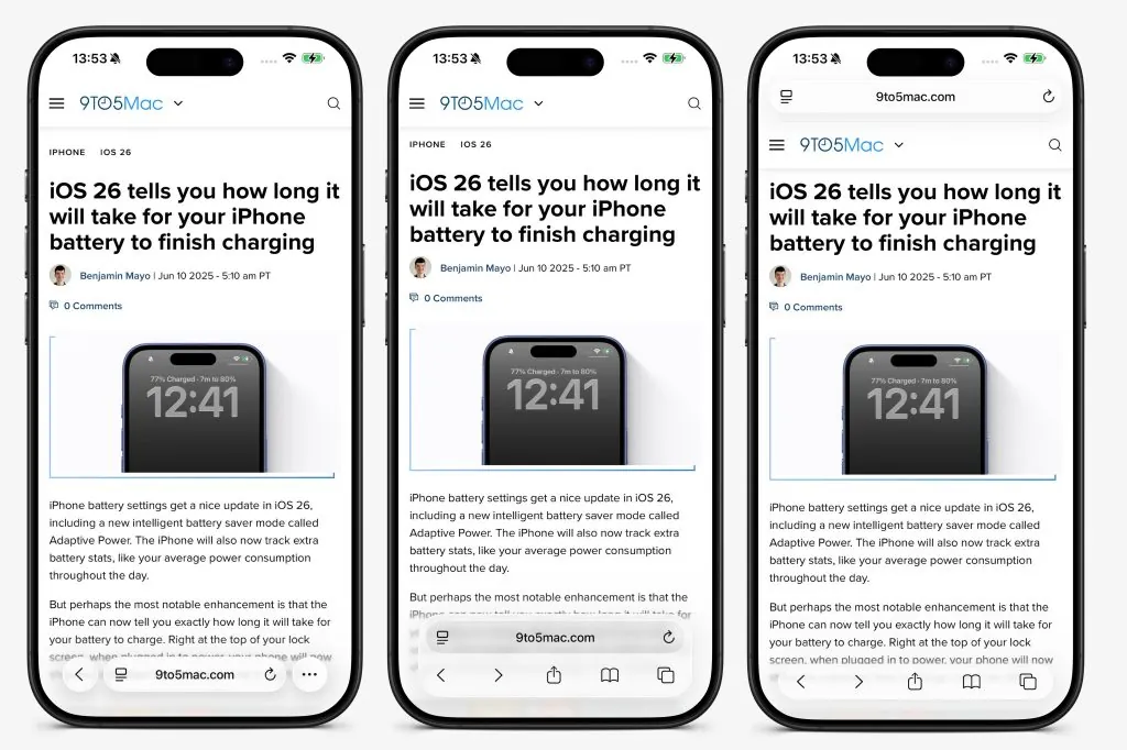
Safari’s three address bar layouts are not new. Apple documents the ability to change the Safari layout on iPhone, and the current layout set consists of Compact, Bottom, and Top, with Compact presented as the default design in iOS 26-era coverage.[2][3] What changes the decision in iOS 27 is that Compact no longer has to be treated as the pretty layout that hides the thing frequent tab users need.
In iOS 26, Compact could feel like a penalty for anyone who lived in tab view. The bar was reachable, but the All Tabs control was less direct, and Start Page destinations such as Bookmarks, Reading List, and History were not sitting where many people expected them. The current iOS 27 beta reverses those two irritations: All Tabs is back in the Compact toolbar, and the Start Page again gives you those library shortcuts up front.[1]
That does not make Compact automatically best. It makes the choice fairer. If the control you reach for several times a day has returned to the bar, the layout can be judged by its gestures and thumb reach instead of by one missing icon.
Change the layout first, then test it in Safari
Start in Settings, because that gives you the cleanest view of the three choices. On iOS 26, the path was Settings > Apps > Safari > Tabs, where you could choose Compact, Bottom, or Top.[3] On the iOS 27 beta run used for this guide, the same Settings route was the one to check before testing the layouts in Safari.
| Layout | Best fit | Main tradeoff to test |
|---|---|---|
| Compact | People who want maximum page space and frequently switch tabs | Requires confidence with bar gestures and a smaller toolbar target area |
| Bottom | One-handed browsing with more visible controls | Uses more vertical space than Compact |
| Top | People who prefer the older desktop-like visual model or do not want the bar under their thumb | Less thumb-friendly on larger iPhones |
There is also an in-browser shortcut worth checking before you dig through Settings every time. iOS 26 tutorials documented an aA-button layout switch inside Safari, allowing the address bar position to be changed without opening Settings.[4] Treat that as a verify-on-device feature in iOS 27: if the aA shortcut is still present on your build, use it for quick comparison; if it is not, Settings is the reliable path.
Compact is the layout to retest, not blindly accept
Compact is the most interesting iOS 27 choice because it changed the most in daily use. With the All Tabs icon visible again in the Compact toolbar in the current beta, the layout no longer asks frequent tab users to remember a hidden route just to see what they have open.[1] That one control changes the mood of the whole design.
Run this test before deciding. Open three or four ordinary pages. Tap the All Tabs icon. Return to a page. Swipe left and right across the address bar to cycle through tabs. Swipe up from the Compact bar to open All Tabs. Long-press the address bar and confirm that copy and share actions are where your thumb expects them. Then long-press Back to reveal that tab’s history.
Those gestures are not imaginary power-user tricks. iOS 26 Safari guidance documented swiping left or right across the bar to move between tabs, swiping up from the Compact bar for All Tabs, long-pressing the address bar to copy or share the link, and long-pressing Back to see the tab’s history.[5] iOS 27’s restored controls matter because they sit on top of that gesture layer instead of replacing it.
Compact still has one annoyance worth taking seriously: the tight area below the toolbar can invite mis-taps, and CNET’s iOS 26 testing noted that tapping below the toolbar could kick the user out of Safari.[5] If that happens to you twice during the test, do not keep Compact out of loyalty to the default. A layout that makes your thumb defensive is not a productivity workflow; it is a small daily tax.
Choose Compact if the restored All Tabs icon is easy to hit, bar swipes feel natural after a few minutes, and you care about keeping as much page content visible as possible. It is especially good for people who open tab view constantly, move between research pages, and collect links before sending them somewhere else. If Safari is part of a larger capture routine, the same discipline applies when you build an iPhone note-capture workflow: the control you touch fifty times matters more than the feature you admire once.
Bottom is the safer one-handed choice
Bottom is the layout to pick when you want the bar near your thumb but do not want Compact’s tighter control strip. It keeps the address area low and gives the interface a more explicit toolbar feel, which can be calmer if you are still rebuilding Safari muscle memory after iOS 26.
The cost is space. CNET’s iOS 26 layout testing noted that Bottom and Top consumed more vertical room than their iOS 18 counterparts.[5] On a large iPhone, that may be a fine trade. On a smaller screen, it is more noticeable when reading long pages, filling web forms, or using Safari beside another capture habit.
Bottom is also the layout I would give to someone who does not want a lecture about gestures. They can still learn swipes and long-presses, but they are not punished as quickly when they forget them. If your main Safari actions are open page, search, share, back, and occasionally check tabs, Bottom is the least fussy modern choice.
Top is for visual stability
Top is not the most one-hand-friendly setup, but it has a legitimate audience. If you came from older Safari habits, or you simply dislike having the address bar under your thumb while scrolling, Top reduces the feeling that the browser is moving around beneath you.
The reach problem is real on larger phones. If you often search from the address field, edit URLs, or open new pages while holding the phone in one hand, Top can make your hand travel more than it needs to. But for people who mostly read a page after opening it from another app, that may not matter. The layout is slower only if the controls it moves away from you are controls you actually use.
The five-action decision test
Do not choose based on screenshots. Choose after one short loop in each layout:
- Open a new page from the address bar.
- Open All Tabs, then return to the page you were reading.
- Swipe across the address bar to move to the next and previous tab.
- Long-press the address bar and copy or share the current link.
- Long-press Back and reopen something from that tab’s history.
If Compact passes all five without thumb hunting, keep Compact. You get the most page space, the restored All Tabs icon, and the fastest bar-swipe rhythm. If Compact fails because you keep missing the toolbar or accidentally leaving Safari, use Bottom. If both bottom layouts feel visually busy or physically annoying, use Top and accept the longer reach.
There is one honest boundary: if you rarely open All Tabs, the iOS 27 Safari address bar layout is not going to transform your productivity workflow. Pick the version that feels least annoying, learn the long-press actions for links and history, and move on. The layout matters most for the people who live in tab view; everyone else should spend less time optimizing the bar and more time reading the page.
References
- I've Been Running the New Safari on iOS 27, and My Thumbs Are Already Happier — CNET
- Change the layout in Safari on iPhone — Apple Support
- iOS 26: Safari lets you choose between three tab bar designs — iDownloadBlog
- Change the Location of Safari's Address Bar — Dan's Tutorials
- Not a Fan of Safari's New Look in iOS 26? You Can Change It — CNET
Comments
Join the discussion with an anonymous comment.