
A firm I know bought a workflow tool with all the right features. Dashboards, automated reminders, recurring templates, a client portal. They spent three months evaluating, another two migrating. And after the first close cycle, nothing had changed. The partner told me: “We still spent the same number of hours chasing clients for documents. The reviewer still got a pile of files at 5 PM on Friday. We just saw it on a prettier screen.”
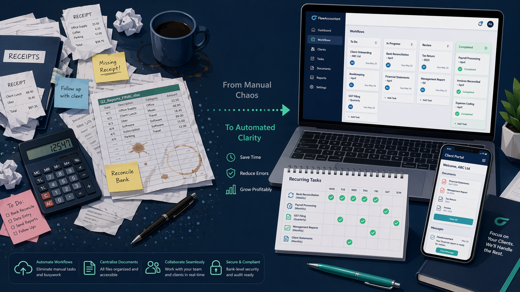
This is the most common buying mistake in accounting workflow software. Xenett states it plainly: firms choose tools based on features instead of failure points. They buy what looks good in a demo instead of what fixes where work actually waits.
If your firm has 2 to 100 staff and you are evaluating accounting workflow software this year, start here: map your intake-to-delivery pipeline before you Google a single vendor. Then find where work actually waits. That’s the only way to make a purchase that changes anything.
Walk Your Pipeline and Find Where Work Waits
Most firms think they know their process. But ask the partner to describe it in writing, and within ten minutes you get a list of exceptions, workarounds, and “oh, that’s different for the tax team.” The first step is not to open a spreadsheet of features. It is to draw a simple pipeline from the moment a client sends a request to the moment the deliverable lands. Include every handoff: request comes in, documents collected, data entered, first review, revisions, final approval, delivery. For each step, note who does it and how long it usually takes.
Once you have a map, look for the gaps. Where does the work pile up? In the firms I have worked with, the bottleneck is almost never a missing feature. It is usually one of three things: the client takes five days to return a signed engagement letter, the reviewer queues three file notes at 5 PM on a Friday afternoon, or the associate spends two hours reformatting a file after review because the template didn’t carry through.
A demo never shows you these waits. A demo shows an ideal scenario where every client responds instantly and every file fits the template. The real test is what happens during a close cycle with real clients.
The Financial Cents 2025 State of Accounting Workflow Automation Report found that 73.9% of firm owners prioritize workflow dashboards. A dashboard is a fine thing to want, but a dashboard on a broken process only shows you how broken it is faster. Map first. Find the waits. Then you know what you actually need.
Check Integrations and Operating Model – Quickly
Before you score a single vendor, list every system your firm depends on: QuickBooks Online, Xero, tax preparation software (Ultratax, Drake, ProConnect), CRM, document management, payroll, and any specialized industry tools. Then ask the vendor whether the integration is native, API-only, or requires a third-party connector. The Karbon 2026 State of AI in Accounting Report notes that 83% of respondents report growing data security awareness; integration points are a common vector for data exposure. Do not assume a tool’s integration is secure just because it is listed on a marketplace.
Also pick your operating model quickly. You really have three patterns: template-first (repeatable checklists sent out), portal-first (clients interact through a secure space), and review-gate (work flows through approval stages). If client document chase is your top bottleneck, portal-first likely wins. If internal review queues hurt, review-gate matters more. Our full comparison article maps operating models to specific tools. The point here is not to overthink the label – just pick the model that best fits your failure points.
Build a Weighted Scorecard, Not a Feature Checklist
This is where most buyers go wrong. They list features (client portal, automated reminders, time tracking) and check boxes. Instead, build a scorecard that weights each criterion by how directly it addresses the failure points you found.
Xenett recommends a weighted scorecard with these dimensions: recurring templates, review gates, client requests, WIP visibility, integrations, permissions. I would add: review workload tracking and rework measurement. The Financial Cents report found that 50.7% of firm owners value recurring projects – a strong signal but not a substitute for your own weighting.

| Criterion | Weight (1-5) | Why It Matters |
|---|---|---|
| Recurring templates | 5 | Directly cuts time spent rebuilding the same workflow each month. |
| Review gates | 4 | Controls the bottleneck that causes late-night reviewer pile-ups. |
| Client requests via portal | 4 | Reduces email chase for documents and signatures. |
| WIP visibility | 3 | Gives partners a real-time picture; helps workload balancing. |
| Integrations | 5 | Without QuickBooks/Xero connection, the workflow is broken before it starts. |
| Permissions | 2 | Important for security, but rarely the primary failure point. |
Assign a weight (1 to 5) to each criterion based on your failure points. Then score each vendor out of 5 per criterion and multiply. The result is a single number that reflects fit, not feature count. I have seen firms use this and discover that the vendor with the flashiest dashboard scored lower than a simpler tool because it lacked the integration their tax team needed.
Pilot with Real Clients – The Step Everyone Skips
This is the single most important step, and it is the one firms rush past more than any other. A demo lasts 45 minutes and shows you what the vendor wants you to see. A free trial lets you click around for a week. Neither reveals what happens when a client who takes five days to return a signed engagement letter, or a reviewer who queues three file notes at 5 PM on a Friday, enters the system.
"If you don't pilot with real clients, you won't see that the file landing in the reviewer's queue still costs two hours of reformatting."
Xenett suggests a pilot with 5 to 10 clients for one full close cycle, limited to one service line and one template. They estimate a pilot can run in 2 to 4 weeks if scoped tightly. I would add: choose clients with different response patterns – one fast, one slow, one that always needs a reminder. That is how you discover whether the tool’s automated reminders actually change behavior or just add noise.
Roll Out and Measure What Changed
The pilot gives you a baseline. Measure these before you roll out: on-time close rate, cycle time from intake to delivery, work-in-progress aging by stage, rework rate after review, reviewer queue length at peak times. Then track the same metrics after full rollout.
The Financial Cents report says 63.2% of firm owners believe automation freed them for high-value work. That is self-reported. Objective metrics are harder to argue with. If the rework rate does not drop, the tool did not solve the failure point – it just automated the wrong step.
Xenett gives a rollout timeline of 30 to 90 days for full implementation. The variation depends on how many service lines you migrate at once and whether you have dedicated change management capacity. Migrate one service line at a time, and give each team a clear cutover date.
Common Buying Mistakes
- Choosing features instead of failure points. This is the root of almost every regretted purchase.
- Believing vendor time-savings numbers without accounting for rework. Karbon’s ROI calculator claims 858 hours saved per employee per year. Does that subtract the hours the reviewer spent checking AI output? Capterra found 37% of accountants find AI errors more than half the time.
- Adopting AI without cleaning the workflow first. Karbon reports that 98% of firms use AI daily, but their survey is of Karbon users. Capterra’s broader survey puts real AI use at 53%. The gap matters because firms that rush to AI on a broken process end up with broken automation.
- Skipping the pilot. Already discussed, but worth repeating: it is the most skipped and most regretted shortcut.
Vendor Shortlist – Use Your Scorecard, Not the List
The following table lists common options. Do not use it as a shopping list. Go back to your weighted scorecard from Step 5 and score each one against your failure points.
| Vendor | Starting Price | Best Fit |
|---|---|---|
| Financial Cents | $19–$69/user/mo | Firms that want built-in time tracking and project dashboards. |
| Karbon | $59–$99/user/mo | Mid-size firms with complex workflows; strong template library. |
| TaxDome | $700–$1,200/seat/yr | Firms that need a full client portal with document management. |
| Jetpack Workflow | $40–$49/user/mo | Small firms wanting simple workflow tracking without a portal. |
| Pixie | $129–$329/mo (by client count) | Firms with many small clients; unlimited users. |
| Aero Workflow | $108/mo for 1-5 users | Growing firms that want flat firm-level pricing. |
Your final decision should answer one question: does this tool reduce the wait that costs you the most? If the answer is yes, the feature list can be shorter than you think. If the answer is no, no amount of dashboards will fix it.
Comments
Join the discussion with an anonymous comment.